Guides · October 25, 2026
How to Make a Party Flyer: The Design and Information Checklist That Gets People There
How to make a party flyer that works: the information checklist guests actually need, a readable type hierarchy, one strong image idea, and a proof pass before sharing.
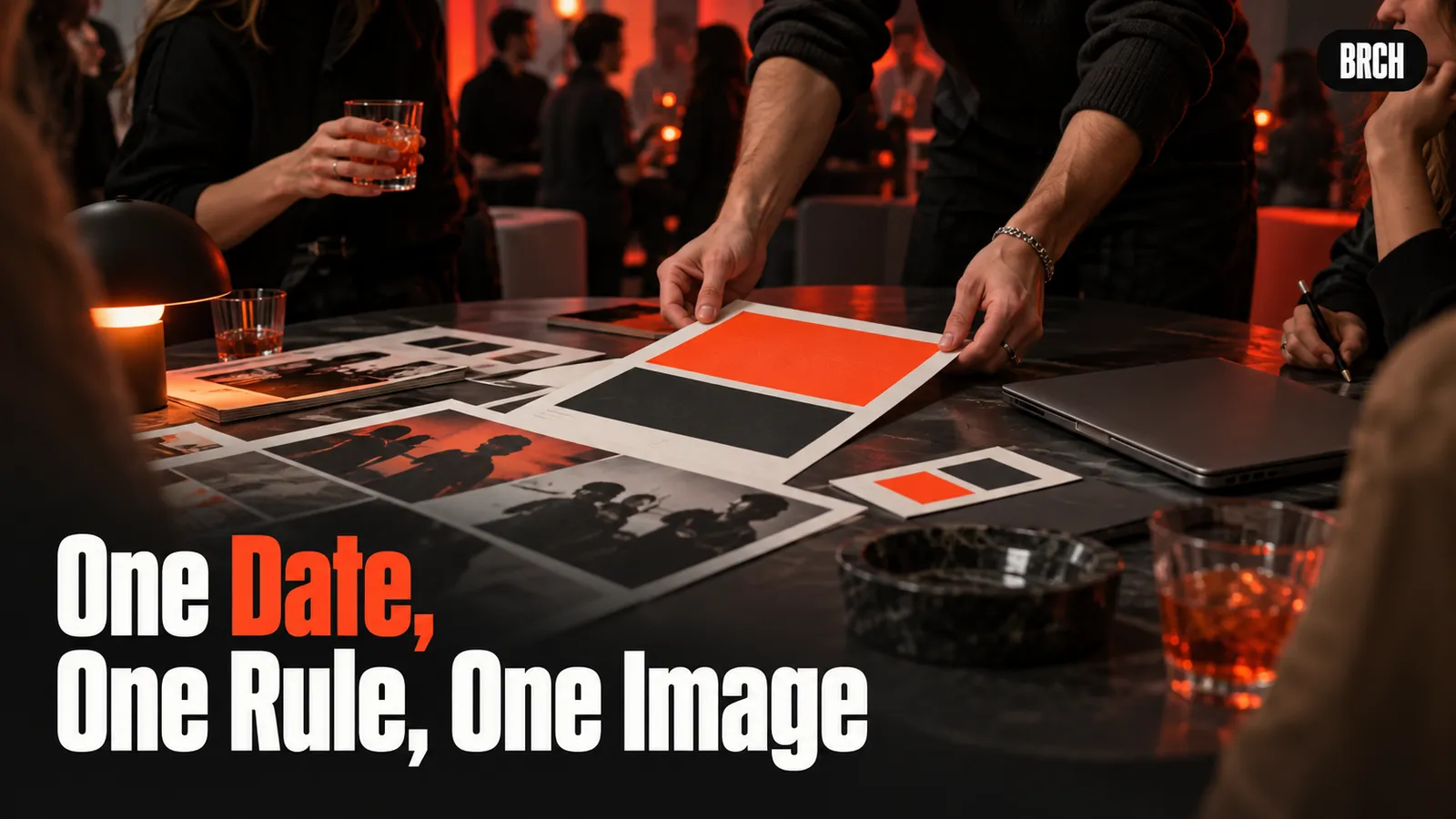
A party flyer has one job: a guest should be able to answer what, when, where, and how to join, from a three second glance, and still have something worth screenshotting. Advice: lead with the party name and date at reading distance, run the full information checklist before any styling, use one strong visual idea instead of five, and proof the finished flyer at phone size with fresh eyes. No tool price, tool statistic, venue, date, or BRCH edition is claimed in this guide. All guidance is advice, labelled as advice.
Key Takeaways
- Information before decoration. A beautiful flyer missing the start time or the address area has failed at its only job.
- Hierarchy is the design. Three sizes of type, biggest for the name and date, does more than any effect.
- One visual idea, held consistently, beats a collage. The theme should be readable before the words are.
- Proof at phone size. Most guests will only ever see the flyer on a phone screen, often in a chat thread.
Run the information checklist first
Advice: write out the full information set in plain text before opening any design tool, and check the flyer against it at the end. The checklist: the party name or theme, the day and date written in full, the start time and, if there is one, the end time, the location at the level guests need to plan, how to confirm attendance or get the full address, any dress code or bring something note, and who is hosting, so a forwarded flyer still explains itself to a stranger.
Decide what stays off the flyer on purpose. Advice: for a house party, the full street address often belongs in the follow up message to confirmed guests rather than on an image that gets forwarded freely. The flyer can carry the neighbourhood or a landmark level location, with a line saying the address comes with confirmation. That is a privacy choice for the host to make deliberately, not a detail to forget by accident.
Build a hierarchy a glance can read
Advice: use three levels of type and nothing more. Level one, the party name and the date, readable across a room or at thumbnail size. Level two, the start time, location line, and theme or dress note. Level three, the small print: confirmation details, host name, and any conditions. If everything is large, nothing is, and the eye gives up in the order guests can least afford, usually right before the start time.
Keep the text count low. Advice: every line on a flyer competes with every other line, so cut any sentence that the invitation message can carry instead. The flyer is the poster, not the letter. The theme clarity discipline from how to pick a party theme is the test: if the theme needs a paragraph, it is not flyer ready yet. One sentence, then let the image do the rest.
Choose one visual idea and hold it
Advice: pick a single visual idea that states the theme, a colour world, a recurring object, a photographic style, and build the whole flyer from that one decision. A costume party flyer in one bold colour with one repeated shape will be remembered and recognised when it reappears in a chat. A flyer with six fonts, four images, and a gradient has no identity to recognise.
Treat contrast as a design rule, not a taste question. Advice: text must sit clearly against its background at arm's length, which in practice means testing the flyer zoomed out, squinted at, and in bright light on a phone. The light and legibility thinking in party photography tips applies to images you design as much as images you shoot: if the subject does not separate from the background, the message is lost.
Leave margins. Advice: keep type away from the edges, because flyers get cropped by chat previews, story formats, and printers, each in a different place. Anything important near an edge will be cut by one of them.
Proof it like a guest, then share it once
Advice: proof in three passes. First, the facts pass: date, day of the week against a calendar, times, and spelling of names, checked character by character, because a flyer with the wrong day is worse than no flyer. Second, the stranger pass: show it to someone uninvolved for three seconds and ask what, when, and where. Their answers are the flyer's real content. Third, the phone pass: view it at the size it will appear in a chat thread, not at design size on a big screen.
Share the corrected version once, in the channels your guests actually read, and resist reissuing small corrections as new flyers. Advice: if a fact changes, send a clear text correction naming the change, and update the flyer only if the change is to the date, time, or place, the three facts guests act on.
FAQ
What is the most common flyer mistake? Advice: styling before information. Hosts polish a design, then squeeze the start time into a corner at small size. Run the checklist first and the design has something to serve.
How much text belongs on a flyer? Advice: the checklist, and almost nothing else. Name, date, time, place, theme, and how to confirm. Everything explanatory belongs in the message that carries the flyer.
Does this guide recommend a design tool? No. No tool, price, feature, or performance claim is made in this guide, because no tool data is on record for this topic. The checklist and hierarchy work in any tool, including paper.
Is there a BRCH flyer this guide is based on? No. No BRCH flyer, edition, venue, or date appears in the record files for this topic, so none is claimed. This guide is general advice only.
Sources
- All guidance in this post is general hosting and attire advice, labelled as advice. No BRCH edition, venue, date, or price is claimed for this topic.
The camera side of the same night is covered by Party Photography Tips.